Sports · Asia
Learn, play, become a padel legend
A padel community app for booking courts, joining matches and tracking progress.
- Client
- The Padel Society
- Sector
- Sports · Asia
- Services
- UX, UI, Design System
The Padel Society helps players of every level find courts, join open matches, track their progress and connect with other players. It also gives clubs the tools to run bookings and events.
The design keeps the sport's social energy front and centre while making the practical parts, like booking, effortless.
Behind the screens sits a design system, so every new feature is built from the same parts.
Inside the product
Inside the Padel Society app
01
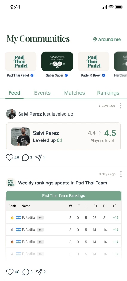
A feed for the whole community
Players belong to communities, shown as a row of tiles at the top of the app, with a blue tick on verified ones. Tabs lead to the feed, events, matches and rankings, and the feed is made of what players are doing: levelling up, climbing the weekly rankings and more.
- Community tiles across the top, verified ones ticked
- Feed, Events, Matches and Rankings one tap apart
- Likes, comments and sharing on every post
02
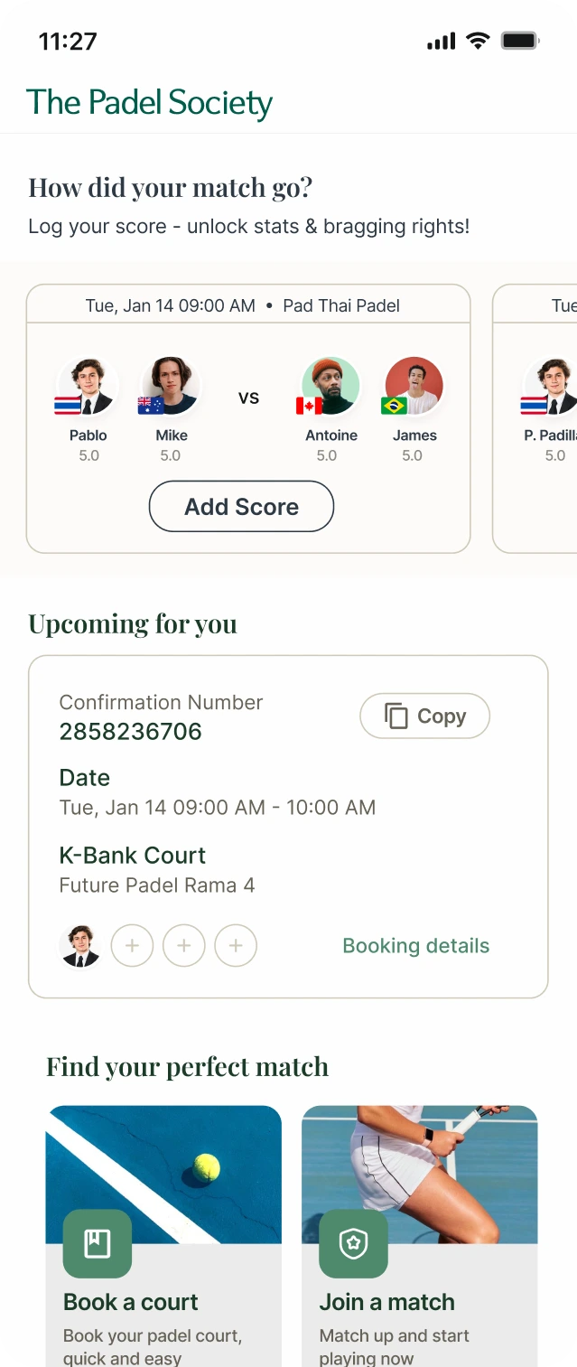
A home screen built around the next game
Home starts with the match just played and asks how it went, then shows the next booking with its confirmation number, date and court. Two clear ways in sit below: book a court, or join a match.
- Add Score prompt for recent matches
- Upcoming booking with a confirmation number to copy
- Book a court and Join a match, side by side
03
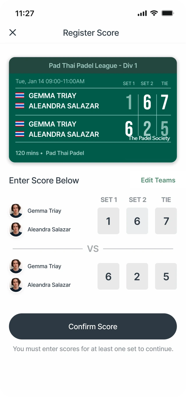
Score it, celebrate it, share it
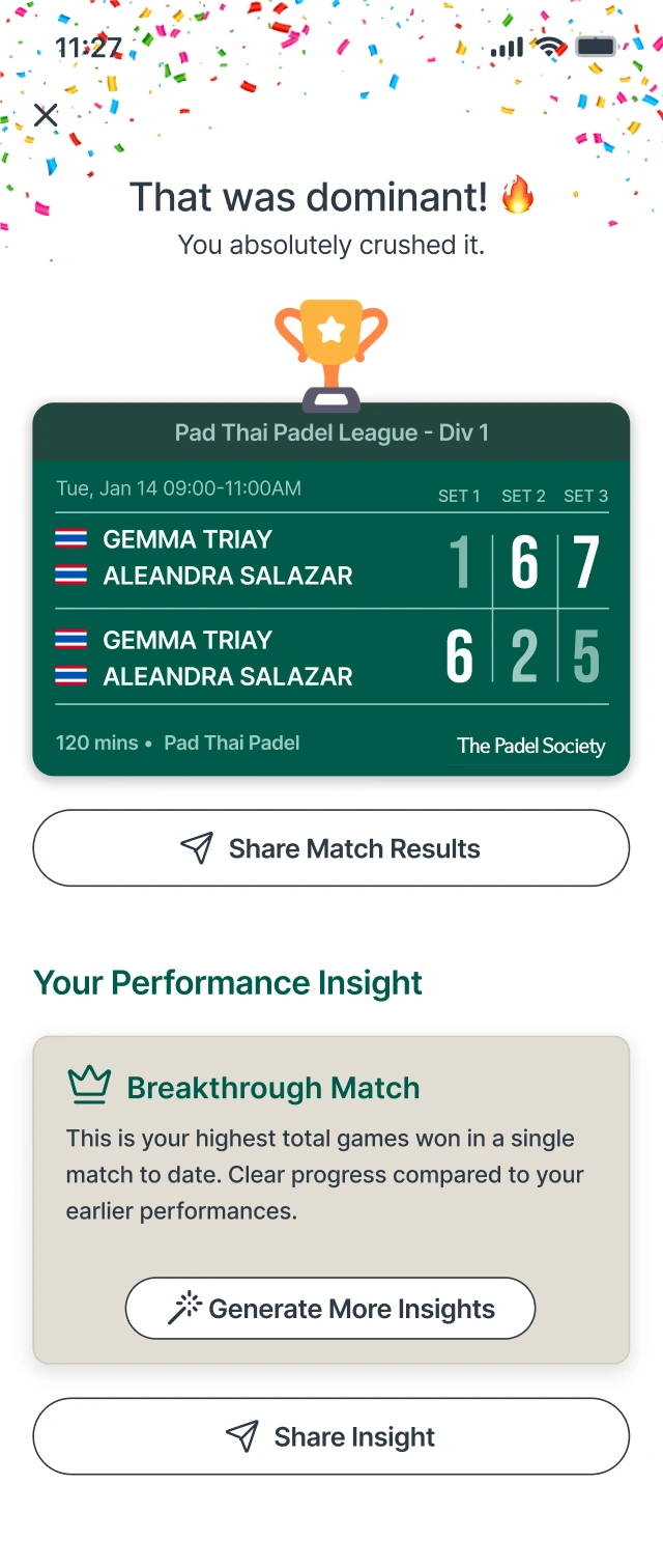
Logging a score takes one screen: a scoreboard card at the top and a box for each set. Confirming it leads to a result worth sharing, with confetti and a trophy for a win, and a performance insight in plain language.
- Score boxes for each set, with a note on what is needed to continue
- A shareable result card carrying the league and the brand
- Insights such as Breakthrough Match, one tap from sharing
Design system
A design system built to be reused
Every screen above is built from the same set of parts. We organised them into a design system: foundations first, then the components made from them, then the patterns that combine those. A new feature starts from what already exists, not from a blank page.
Name things for their job
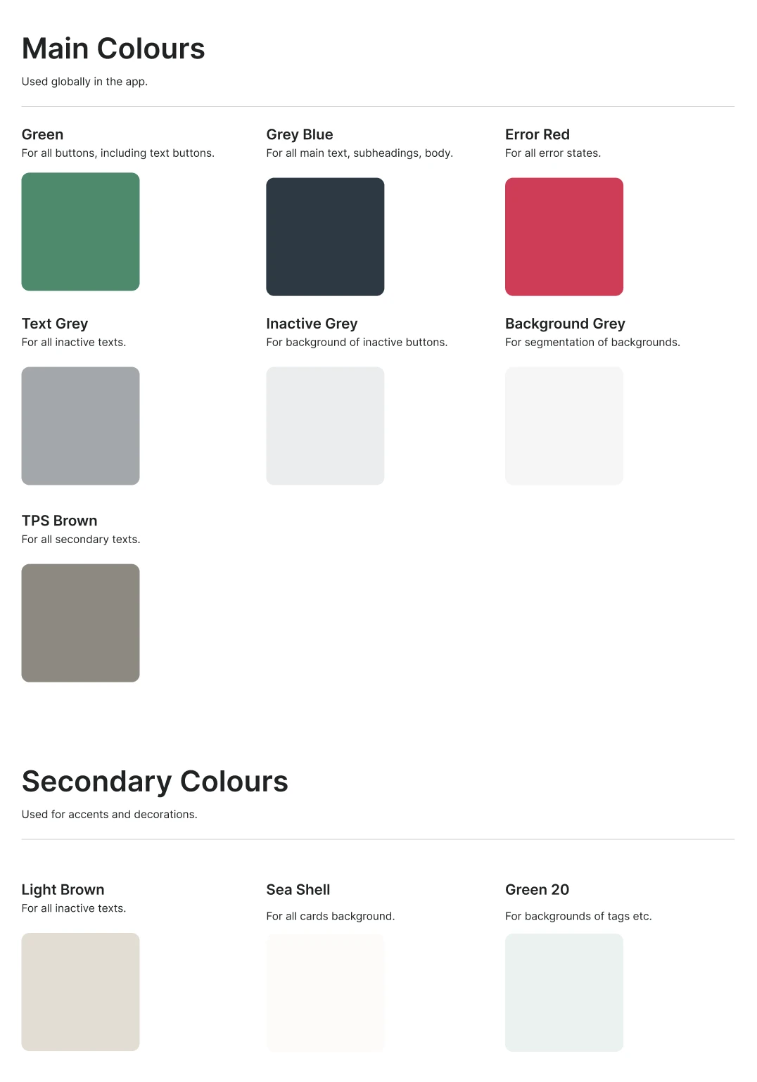
Colours and type styles are named for what they do. Green is for buttons, Sea Shell is for card backgrounds, TPS Brown is for secondary text. Nobody has to guess which to pick.
Design small, then combine
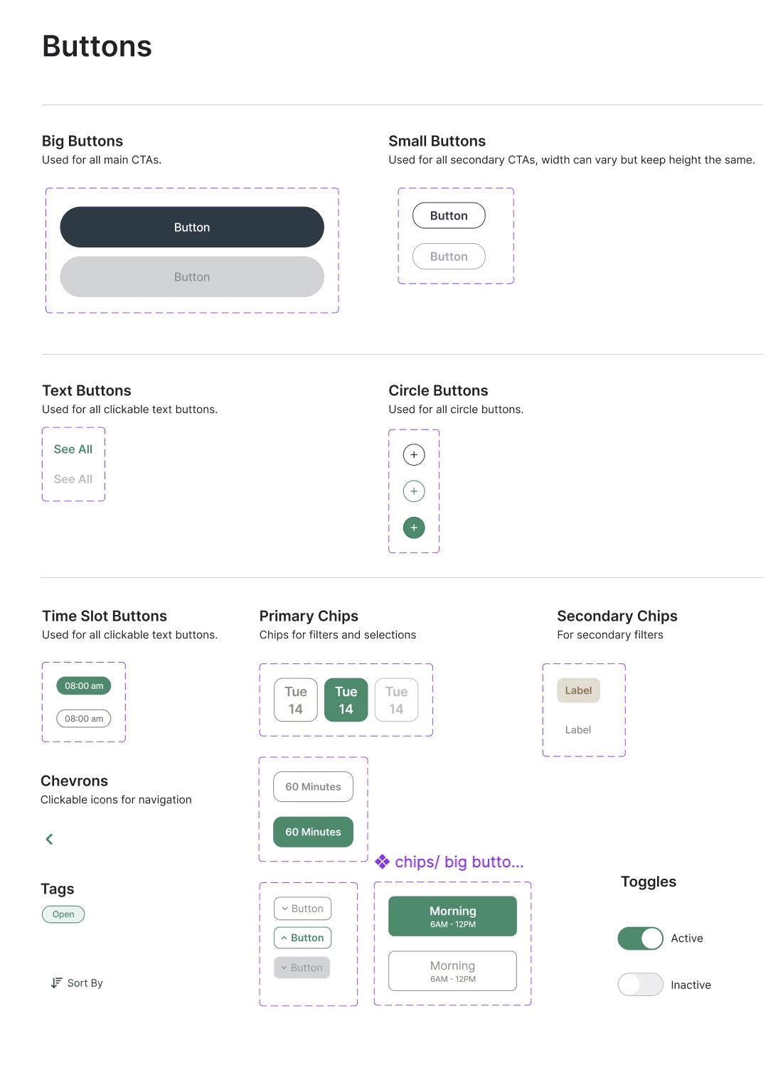
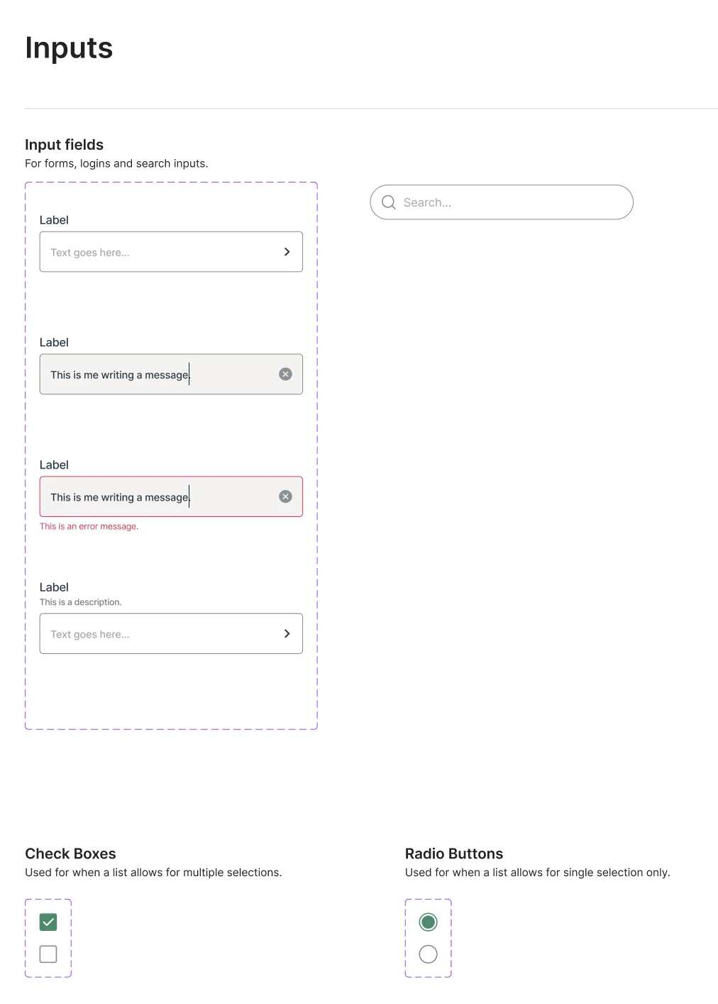
Buttons, inputs and menus are drawn once, with every state. Cards, sections and pop-ups are then assembled from those parts instead of being redrawn.
Say what each part is for
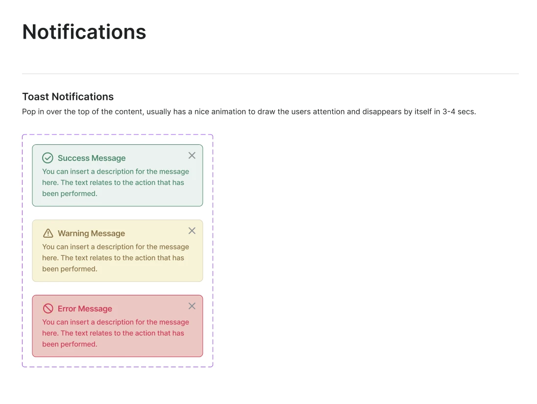
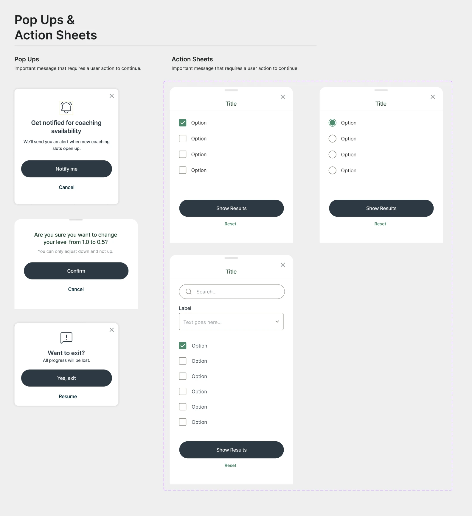
Every sheet states the job of each part, from big buttons for main actions to a toast that disappears by itself in a few seconds, so new screens can be built from the system.
01
Foundations
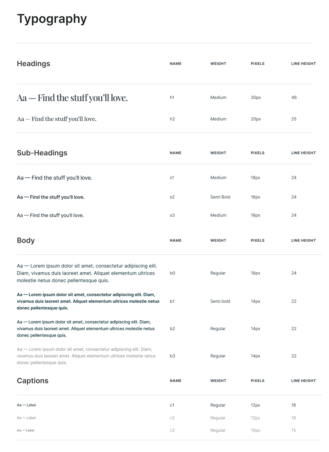
Colour and type, defined once. Main colours do the heavy lifting and secondary colours handle accents. A serif sets the headings over a clean sans for everything else, from h1 down to captions.
02
Components
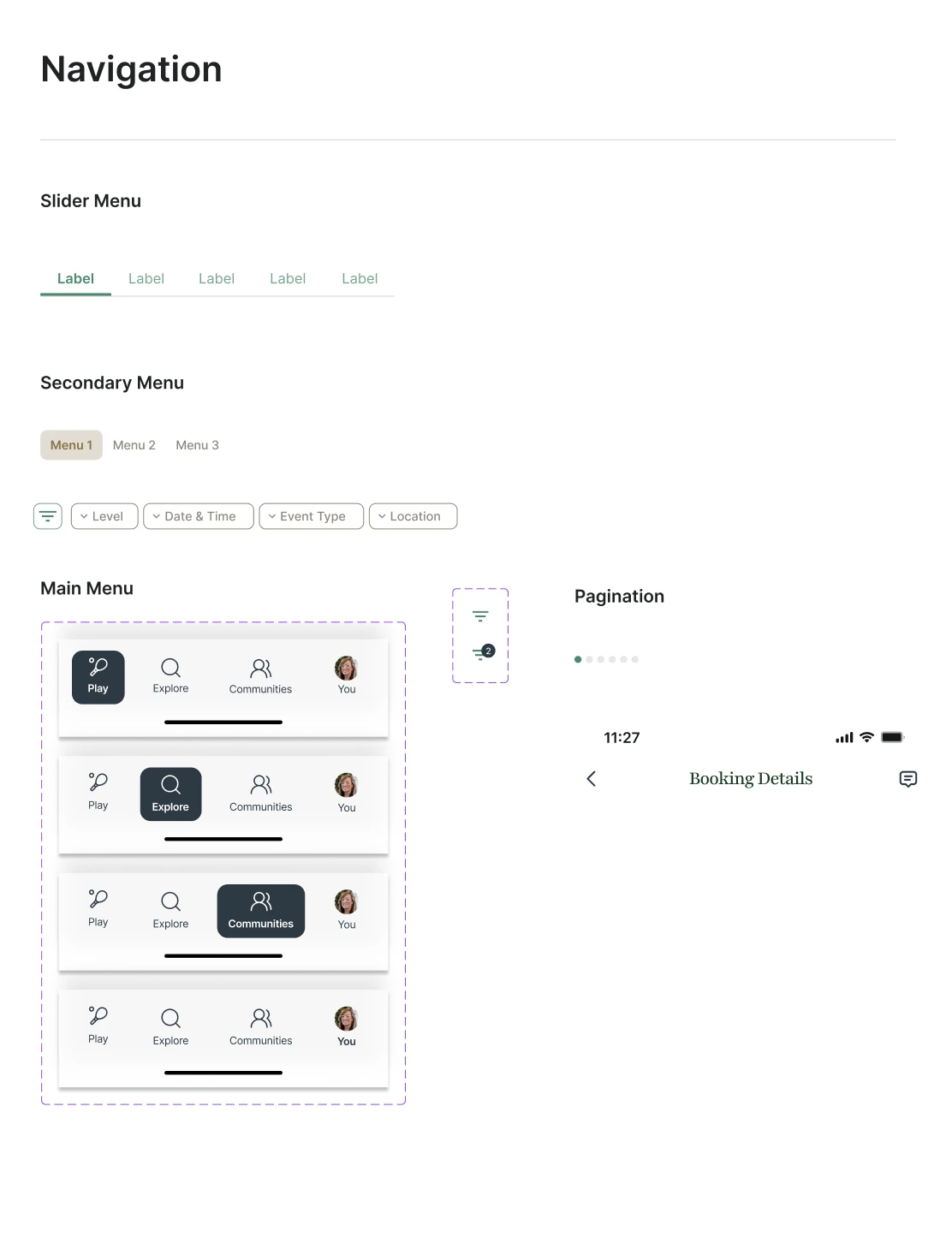
The small parts, each with its states: big, small, text and circle buttons, chips, tags and toggles, input fields, search, checkboxes and radios, and the slider, secondary and main menus.
03
Patterns
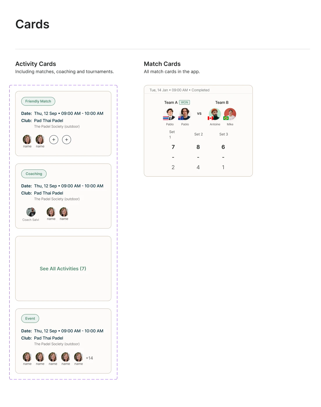
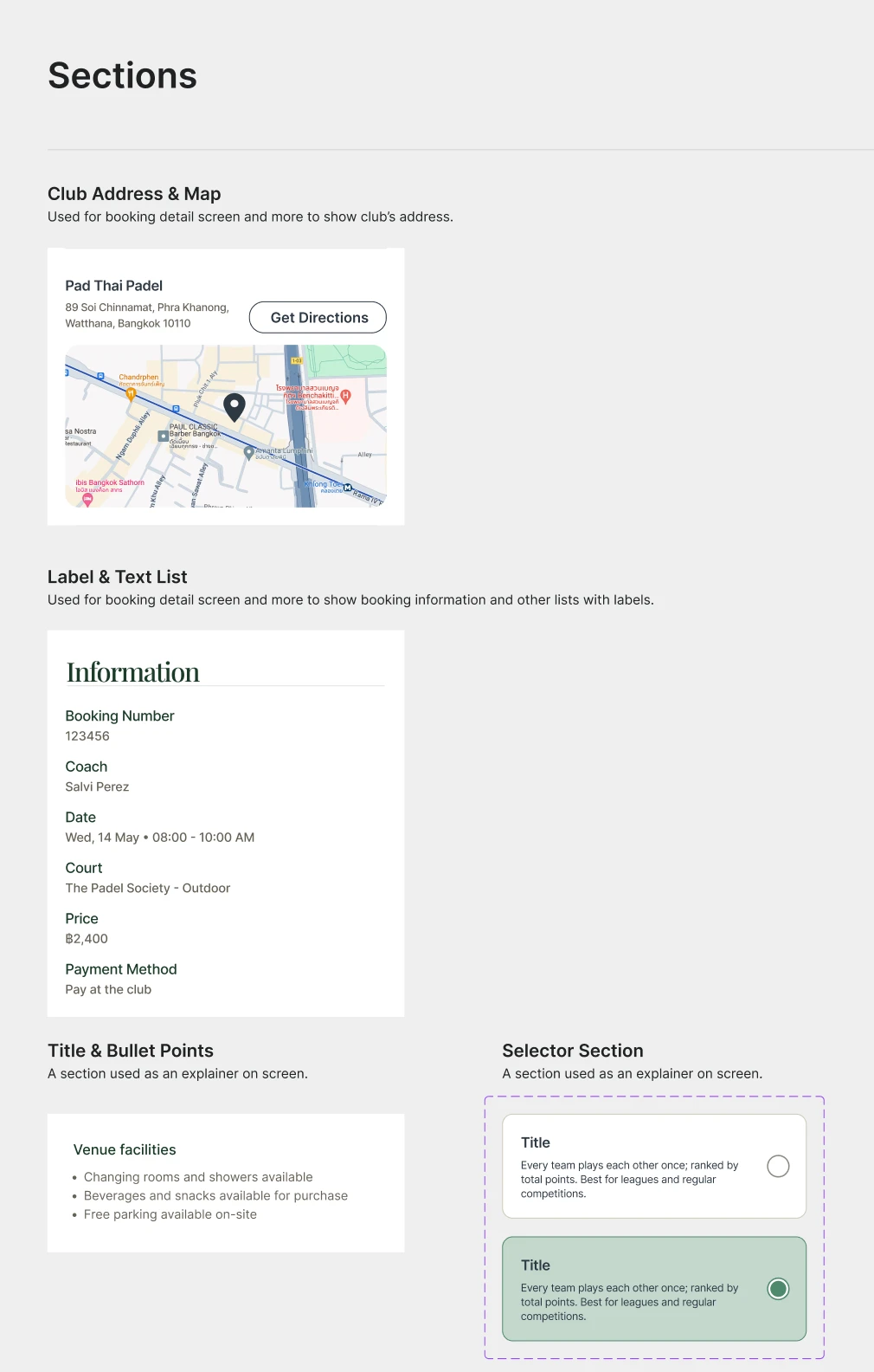
Components combined into the blocks screens are made of: activity and match cards, club address and map, label and text lists, toast notifications, pop-ups and action sheets.
Next project
SETView case study